
Key Takeaways
| Point | Details |
|---|---|
| UX is a ranking signal through behavioral feedback | Even when not a “direct” ranking factor, UX drives dwell time, pogo-sticking, and CTR — all of which Google’s systems use |
| Above-the-fold composition decides whether the visit starts | The first viewport on mobile sets the engagement trajectory for the entire session |
| Internal link UX > internal link SEO | Links readers actually click are worth more than links optimized only for crawler signals |
| Form UX is conversion AND SEO | Mobile form simplification lifts conversion 30–50% and feeds engagement signals back to Google |
| Trust signals shift CTR and dwell time | Visible address, real photos, license numbers, and review snippets move both conversion and indirect SEO metrics |
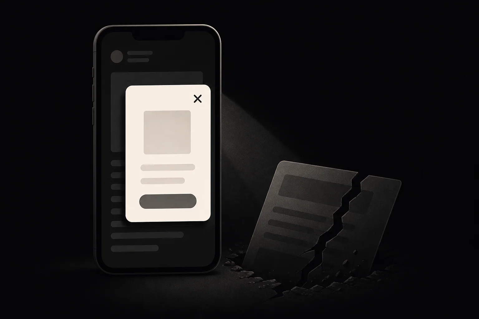
| Intrusive interstitials still get demoted | The 2017 mobile interstitial penalty is still active — pop-ups covering content on mobile landing pages get hit |
The version of “UX for SEO” most articles describe — Core Web Vitals plus mobile responsiveness — is the floor, not the ceiling. The UX patterns that actually move Chicago small business rankings are the ones that change behavioral signals: above-the-fold composition that earns the scroll, content density that holds attention, navigation that signals topical depth, internal links readers actually click, forms that don’t tank conversion, trust signals that lift CTR, and the absence of anti-patterns (interstitials, ad density, deceptive layouts) that demote pages directly. The mistake is treating UX-for-SEO as a Core Web Vitals exercise. The opportunity is treating it as the design decisions that compound every other SEO investment.
How User Experience Becomes a Ranking Signal
User experience affects search rankings through three distinct mechanisms, only one of which is documented as a “direct” ranking factor. Understanding which is which determines what to fix and why.
The direct signals: page experience. Google’s confirmed direct page experience signals are Core Web Vitals (LCP, INP, CLS), mobile-friendliness, HTTPS, and the absence of intrusive interstitials on mobile. These are the ones every SEO post about UX talks about. They matter, but they’re the floor. We covered them in depth in our Core Web Vitals guide.
The indirect signals: behavioral feedback. Google has consistently said that dwell time, click-through rate, and pogo-sticking are not direct ranking factors. Google has also consistently used these signals through systems like RankBrain, Navboost, and the machine learning models that refine rankings post-deployment. The distinction between “direct ranking factor” and “input to a system that affects rankings” is real but, for the purposes of running a Chicago small business site, practically irrelevant. Pages with poor behavioral signals lose rankings over time. Pages with strong behavioral signals gain rankings.
The contextual signals: E-E-A-T through UX. Visible signals of experience, expertise, authority, and trust on the page itself — named authors with bios, real addresses, real photos, license numbers, dates — feed into Google’s Search Quality Rater Guidelines, which inform the human-rated examples used to train the ranking algorithms. UX patterns that surface E-E-A-T signals lift rankings indirectly through this feedback loop. They also lift CTR and conversion immediately.
The combined picture: UX-for-SEO in 2026 means designing for behavioral and contextual signals, not just for Core Web Vitals metrics. The metrics are necessary; they aren’t sufficient. A page can score 100 on Lighthouse and still pogo-stick because the layout doesn’t deliver on the search intent.
The Behavioral Feedback Loop That Refines Rankings
The mechanism by which UX feeds back into rankings is more concrete than most “UX matters” advice acknowledges. Internal Google documents leaked in 2024 confirmed what SEOs had long inferred from behavior: Google operates a system called Navboost (and related systems with names like Glue and Tangram) that adjusts rankings based on aggregated click and engagement behavior from real users. Whether or not these systems are formally “ranking factors” by Google’s preferred terminology, they are mechanisms that change which pages appear higher for which queries — and they read directly from how users behave on the SERP and on the destination page.
The three behavioral signals that consistently move the needle, in order of measurable impact:
1. SERP click-through rate (CTR). When users see your snippet on the results page, do they click yours or a competitor’s? CTR is heavily influenced by title tag, meta description, structured data (rich snippets, FAQs, reviews), and the URL itself. Pages with above-baseline CTR for a given position tend to rise; pages with below-baseline CTR tend to fall. This is the cheapest behavioral signal to influence — rewriting a title tag is a 5-minute job that can lift CTR 20–40%.
2. Dwell time and the inverse signal of pogo-sticking. Pogo-sticking — clicking your result, returning to the SERP within a few seconds, and clicking a different result — is the strongest negative signal a UX can produce. The user is explicitly telling Google “this page didn’t answer my query.” Conversely, long dwell time without return-to-SERP signals that the page satisfied the query. The shape of the UX that produces long dwell time is consistent: an answer that begins in the first viewport, content density that holds attention through the scroll, and clear paths to either deeper content or a conversion action.
3. Repeat visits and brand search. Users who visit a page, leave satisfied, and later search for the business by name are sending the strongest possible quality signal — they remembered the business. Branded search volume in Google Search Console is one of the most reliable medium-term ranking indicators we track on Chicago client sites. UX that earns memorability (clear brand, real photos, distinctive voice) feeds this signal over months, not days.
The practical implication is that ranking gains from UX work compound. Better UX → stronger behavioral signals → higher rankings → more impressions → more behavioral data → further refinement. The early lift comes from the immediate CTR and dwell improvements. The compounding lift comes from rankings drifting upward over the following 60–180 days as Google’s systems re-evaluate based on the new behavior.
Above-the-Fold Composition: The First 600 Pixels

The first viewport on mobile — roughly the first 600–800 vertical pixels — sets the engagement trajectory for the entire visit. Most Chicago small business sites waste it. The patterns that work and the patterns that don’t are by now well-documented from behavioral data across our client portfolio.
What the first viewport must contain for a service business:
- A clear headline that names the service AND the location (“Chicago HVAC Repair,” not “Quality You Can Trust”). The headline should mirror or closely paraphrase the search query.
- A short subhead (one sentence) that adds the differentiator (“Same-day service across Chicagoland, licensed since 2003”).
- A primary CTA above the fold — phone number for service businesses, “Get a Free Quote” button for higher-consideration purchases. On mobile, the phone number must be a
tel:link. - A trust signal — a license number, a years-in-business count, a star rating, or a recognizable certification badge.
- A real photo above the fold, ideally a team photo or job-site photo, not stock photography.
What kills above-the-fold engagement:
- Hero carousels with rotating slides. Carousels are auto-distracting. Users wait for the rotation, miss the message, and leave.
- Massive hero video that takes 4+ seconds to start playing. The user is staring at a black box or loading spinner during the highest-attention moment.
- Generic value propositions (“Quality service since 1985”). Doesn’t differentiate, doesn’t include the search keyword, doesn’t earn the scroll.
- Cookie notices or chat widgets covering the headline. The cookie banner is usually unavoidable, but it should sit at the bottom of the viewport, not the top.
The behavioral data is consistent: pages where the first viewport answers the implicit question of the visit have 30–60% lower bounce rates than pages where the first viewport requires interpretation. Lower bounce correlates with longer dwell time, which correlates with stronger ranking signals. For service businesses, the phone call funnel starts in this first viewport — anything that delays the phone number or makes it untappable directly costs leads.
Content Density and Scroll Depth
Content density — how much information per unit of screen — affects how long users stay and how far they scroll. The wrong density in either direction hurts engagement. Too sparse (huge hero image, then three sentences, then another huge image, then three sentences) makes the page feel content-light and pushes users to bounce because they can’t find substantive information quickly. Too dense (wall of unformatted text) makes the page feel intimidating and pushes users to bounce because they can’t find a path through it.
The pattern that works is what we call “scannable density” — content rich enough that a fast scroll surfaces the substance, structured enough that a careful read can extract every detail. The practical formula:
- Paragraphs of 2–4 sentences. Longer paragraphs reduce scroll engagement on mobile.
- One H2 per 2–4 paragraphs. Subheads break content into scannable sections and give scrollers visual anchors.
- Bullets and tables for enumerated content. Lists of 3+ items belong in bullets. Comparisons belong in tables. Anything else stays prose.
- One image per major section. Helps scroll engagement without inflating page weight.
- Specific numbers and data points. Concrete claims ($1,500–$4,000, 15–30% lift, 60 days) earn more attention than vague claims (significant improvement, considerable savings).
Scroll depth itself isn’t a direct Google ranking signal — there’s no scroll-depth field that gets read into the indexer. But scroll depth correlates with content engagement, which feeds into the systems Google uses to refine rankings. Practically: a page where 70% of users scroll past the fold and 30% reach the bottom is sending different signals than a page where 20% scroll past the fold. GA4 makes this easy to measure with the default “scroll” event triggered at 90% scroll depth. Track it per page. Pages with low scroll depth need restructuring; pages with high scroll depth and low conversion need a better CTA.
Navigation Patterns That Signal Topical Depth
Site navigation is both a UX system (helps users find pages) and an SEO system (signals topical structure to Google’s crawler). The patterns that work for both are the same.
The pattern: shallow, semantic, consistent.
Shallow — every important page is reachable in 2–3 clicks from the homepage. Restaurants don’t need 4-level category nesting. A contractor doesn’t need “Services → Plumbing → Residential → Drain Cleaning” — the four-level depth fragments link equity and confuses users. Better: “Services” hub page that links directly to “Drain Cleaning” as one of 8–12 service pages.
Semantic — the link text describes the destination. “Plumbing services in Chicago” is a better navigation link than “Learn more” or “Click here.” Google reads link text as a relevance signal for the linked page; users scan link text to decide whether to click. Both benefit from semantic, descriptive labels.
Consistent — the same items appear in the same positions across the site. Header navigation doesn’t reorder on different page types. Footer links match the header structure. Mobile menu mirrors desktop nav (not a “simplified” mobile menu — see our mobile SEO guide for the reasoning).
For Chicago small businesses we audit, the most common navigation mistakes are: too many top-level items (8+ is too many; aim for 5–7), inconsistent labels (Services on header, What We Do on footer), and hover-only mega-menus that don’t work on touch devices. Each one fragments how users move through the site and how Google reads the site’s topical structure.
Internal Link UX (Links Readers Actually Click)

Most internal linking advice in SEO content treats links as crawler signals — “link to your important pages, use keyword anchor text.” That’s necessary but incomplete. The links that actually move SEO are the links readers actually click, because click-through behavior signals to Google that the destination is relevant. A page with 50 internal links to other pages, of which 2 get clicked, sends weaker signals than a page with 10 internal links of which 5 get clicked.
The pattern: contextual, relevant, in the prose.
- Drop links inline where the topic comes up, not in a “related posts” footer block. When a service page mentions Core Web Vitals, link to our CWV guide inline. When a local SEO page mentions Google Business Profile, link to the GBP optimization guide inline.
- Link text describes the destination, not its position relative to the current page. “Our SEO audit checklist” beats “see here.”
- 3–8 internal links per long-form page is the right range. Fewer and you’re not building the link graph; more and you dilute click-through behavior.
- Open internal links in the same tab. New-tab navigation for internal links is friction that drops click-through rate.
The hidden benefit of contextual internal linking is that it lifts the dwell time and depth-per-session metrics for the whole site. A reader who clicks through three internal links from a blog post to two service pages is sending strong engagement signals across all five URLs. A reader who reads one page and leaves sends weaker signals.
Form UX as a Conversion and SEO Signal
Forms are where UX-for-SEO and UX-for-conversion converge most clearly. A form that converts at 4% delivers more business outcomes than a form that converts at 0.5% regardless of how many users see it. A form that converts at 4% also feeds stronger engagement signals back to Google — users who complete forms have longer dwell time, higher session depth, and don’t pogo-stick back to the SERP.
The pattern: minimum fields, mobile-first, no surprises.
- 3–5 fields maximum on the primary contact form for service businesses. Name, phone or email, service needed, “tell us about your job” free-text. Everything else is a follow-up.
- Each field has a visible label, not just a placeholder. Placeholders disappear when the user types and reduce form-completion accuracy.
- Phone number fields use
inputmode="tel"so the mobile numeric keyboard appears automatically. - Email fields use
inputmode="email"andautocomplete="email"to enable autofill. - No CAPTCHA on initial contact forms — reCAPTCHA v3 (invisible) is acceptable; v2 (image grids) tanks completion rates 15–30%.
- The submit button label describes what happens (“Get a Quote,” “Request a Call Back”) rather than “Submit” or “Send.”
- Success state is visible and clear — a green confirmation message, not a redirect to a generic thank-you page with no acknowledgment.
We covered the broader phone-call funnel in our more phone calls from website post, and the lead-generation diagnostics in website traffic but no leads. The headline finding from auditing dozens of Chicago SMB sites: form simplification alone typically lifts mobile conversion 30–50% with no other changes.
Trust Signal Placement: What to Show and Where
Trust signals are the small UX elements that change whether a visitor decides your business is real before they decide your business is good. They affect both immediate conversion and indirect SEO signals through dwell time and CTR.
| Trust signal | Where to place it | What it does |
|---|---|---|
| Real address (street, city, ZIP) | Header or hero on contact page; footer site-wide | Local credibility; matches GBP for NAP consistency |
| Tappable phone number | Above the fold every page; sticky bottom bar on mobile | Direct conversion path; “real business” signal |
| Real team or owner photo | Hero on homepage; “About” page | Signals real people behind the business; lifts trust |
| Years in business or “Since [year]“ | Hero subhead; footer | Longevity = trust |
| License or certification number | Footer; service pages where regulatory | Required-by-law signal in some industries; trust in all |
| Recent review snippet with star rating | Above the fold; near CTAs | Social proof at decision point |
| ”Last updated” date on content | Top of blog posts; service pages with currency | Freshness signal for both users and Google |
| Industry certifications (BBB, Angi, etc.) | Footer; trust section near forms | Third-party validation |
| Project portfolio or case studies | Service pages; dedicated case-study area | Demonstrates experience and competence |
The trust signals that consistently move metrics are the ones that demonstrate real-business-ness — address, phone, photo, years. Logo bars of certifications matter less than they used to. Review snippets with specific quotes outperform generic “5 stars” badges. The placement rule: trust signals near decision points (above the fold, near the CTA, near the form) work harder than trust signals consolidated in a footer or “About” page.
UX Anti-Patterns That Demote Pages
Some UX patterns aren’t just bad — they trigger Google’s algorithmic demotion systems. Avoiding them is non-negotiable for Chicago small business sites trying to rank.
Intrusive interstitials on mobile. Pop-ups that cover the main content immediately on mobile landing trigger Google’s intrusive interstitial penalty, which has been live since 2017 and was reaffirmed multiple times through 2024–2026. The penalty applies to mobile pages and to pop-ups that appear immediately or shortly after landing. Exit-intent pop-ups, age verification, cookie notices that take up reasonable screen space, and legally required interstitials are exempt. Lead-capture overlays that fire 5–30 seconds in are technically exempt but often hurt enough conversion to be net-negative anyway.
Ad density above the fold. Pages where the first viewport is more than 30% advertising trigger the Ad Experience signal. This applies more to publisher and content sites than local service businesses, but any SMB running display ads or affiliate banners on its own site should keep them below the fold and limited.
Deceptive layouts. Buttons that look like “X” close buttons but actually trigger clicks. Sponsored content that doesn’t disclose. Affiliate links without disclosure. These trigger user complaints and can lead to manual actions in egregious cases.
Auto-play video with sound. Demotes through both the page experience signal and direct user behavior — users bounce immediately. Mute auto-play is acceptable; sound-on auto-play is not.
Layout shift from late-loading content. CLS over 0.1 is a Core Web Vitals failure. The biggest source on SMB sites is images without explicit dimensions and ads that load into placeholder boxes. The technical fixes are in our Core Web Vitals guide; the UX implication is that layout shift signals “low quality build” to both users and Google.
Content beneath ads. Even on pages that don’t run intrusive interstitials, pushing the substantive content below 2–3 screens of ads or affiliate banners reduces engagement metrics severely. For SMB sites this is rarely an issue, but for any site monetizing with display ads, content-first layout is the default.
Mobile UX Patterns for Local Search Intent
Local search intent on mobile has a specific UX shape that differs from generic e-commerce or informational mobile design. Someone searching “plumber near me” at 11 PM after their water heater fails has a different need than someone browsing a product catalog. The UX patterns that serve local search intent:
One-tap call. The phone number is a tel: link visible above the fold on every page. For emergency-leaning services (plumbing, locksmith, urgent medical), a sticky bottom-bar with “Call Now” follows the user as they scroll.
One-tap directions. Address links open Google Maps or Apple Maps directly. <a href="https://maps.google.com/?q=123+Main+St+Chicago+IL+60614">Get Directions</a> is the cleanest pattern.
Hours visible immediately. “Open now,” “Open until 9 PM,” or “Closed — reopens at 8 AM” should be visible above the fold on every page, not buried in a footer. For service businesses with 24/7 availability, “Available 24/7” works.
Service area shown explicitly. The neighborhoods or suburbs you serve should be in mobile-visible content, not hidden in a footer block. For a service-area business, this is often the difference between Local Pack inclusion and exclusion.
Mobile-first CTAs. “Get a quote” is fine on desktop. On mobile, “Call Now” or “Text Us” often converts better because phone-and-text are the native mobile actions.
We covered the full mobile-SEO playbook (including the page-speed and indexing implications) in our mobile SEO guide for Chicago small businesses. The UX piece overlaps with but doesn’t duplicate that work — mobile SEO is the engine, mobile UX patterns are the steering.
Matching UX to Search Intent
The biggest UX-for-SEO mistake we see on Chicago small business sites is applying the same page template to every query type. A page built like a corporate brochure can rank for “about [business]” queries but pogo-stick for “[service] cost” queries. A page built like a pricing calculator can convert “[service] cost” but lose “[business] reviews” visitors. Search intent determines what UX pattern the page needs to deliver.
Google classifies queries into four broad intent types — informational, commercial, transactional, and navigational. Each type demands a different UX shape on the destination page.
| Intent type | What the user wants | UX pattern that wins | Example query for a Chicago plumber |
|---|---|---|---|
| Informational | A clear answer to a question | Answer-first paragraph, short scannable explanations, related-topic links | ”what causes a water hammer in pipes” |
| Commercial | To evaluate options before buying | Comparison content, pros/cons, pricing context, trust signals | ”best plumber in Chicago” |
| Transactional | To take an action now (call, book, buy) | Above-the-fold CTA, click-to-call, minimum-friction conversion path | ”emergency plumber Chicago” |
| Navigational | To reach a specific business or page | Clear branding, contact info above fold, hours/address visible | ”[business name] hours” |
The intent of a query is signaled by the SERP itself. When you Google “emergency plumber Chicago,” the first page is the Local Pack, ads, and service business homepages with phone numbers in the hero. When you Google “what causes a water hammer in pipes,” the first page is informational articles with diagrams and step-by-step explanations. The SERP tells you what users want. Pages that don’t deliver the matching UX pattern lose CTR and dwell time even when their content is accurate.
The practical workflow for matching UX to intent on a Chicago small business site:
Step 1: Classify your top queries. Open Search Console, pull the top 20 queries for your site, and tag each with one of the four intent types. Most service businesses see a mix — informational queries pull people in (the blog content), commercial queries qualify them (the service pages), and transactional queries convert them (the contact and emergency-service pages).
Step 2: Audit each ranking page for intent match. For every page ranking on a top query, ask: does this page deliver the UX pattern the intent demands? An informational query landing on a sales-heavy service page is mismatched. A transactional query landing on a long blog post about “how to choose a plumber” is mismatched.
Step 3: Restructure or redirect. When a page is mismatched, either restructure the page to match the intent (rewrite the hero, change the CTA hierarchy, adjust content depth) or build a separate page that does match and redirect the query to it. The page that matches intent will out-rank and out-convert the mismatched page every time.
This is closely related to what we cover in our search experience optimization (SXO) work — analyzing the SERP backwards to understand what Google rewards for each query and structuring pages to match. Intent matching is the UX side of that same discipline.
Where to Start
A focused UX-for-SEO audit on a small business site takes about a day. The sequence that produces the most lift per hour:
Day 1, Hour 1 — Above the fold. Open your homepage on a phone. Does the first viewport contain the service, the location, a tappable phone number, and a trust signal? If not, restructure that one viewport first.
Hour 2 — Forms. Count fields on your primary contact form. If it’s more than 5, simplify. Add inputmode and autocomplete attributes. Replace placeholder-only fields with visible labels. Replace v2 CAPTCHA with v3 invisible.
Hour 3 — Navigation. Count top-level navigation items. Aim for 5–7. Audit link labels for semantic clarity. Confirm mobile menu mirrors desktop nav.
Hour 4 — Internal links. Pick three top blog posts. Add 2–3 contextual internal links each in the prose, pointing to your highest-converting service pages. Move existing “related posts” boxes inline where they belong.
Hour 5 — Trust signals. Audit address, phone, hours, and license numbers across the site. Add a real team photo if you don’t have one. Add a review snippet near the top of the homepage if you have one available.
Hour 6 — Anti-patterns. Audit any pop-ups, interstitials, or auto-play media. Remove or restructure anything that fires on initial mobile landing. Set auto-play video to muted.
Day 2+ — Monitor. Track scroll depth, bounce rate, mobile conversion, and click-to-call events in GA4. Re-audit Search Console CTR by query monthly to spot pages where the UX changes lift CTR.
If you’d rather have us run the UX-for-SEO audit alongside the technical SEO audit and content review, we run it as part of every full audit engagement. The deliverable is a per-page action list with before/after screenshots of the changes we’d make, not a 60-page PDF. Get in touch via /quote or browse our how to choose a Chicago SEO agency guide for context on how we work.